The Weight of Disappearance: a public archive for three sculptures that dissolve
An interactive archive for three dissolving sculptures in New York. Anyone who meets one can photograph it, and nothing is public until it is approved.
- Client
- Matthew Li, artist
- Year
- 2026
- Scope
- Design and development
- Built with
- React, Supabase, Sanity, Leaflet
- Interface
- Four languages, 47 strings each
- Size
- 64 commits, 41 source files
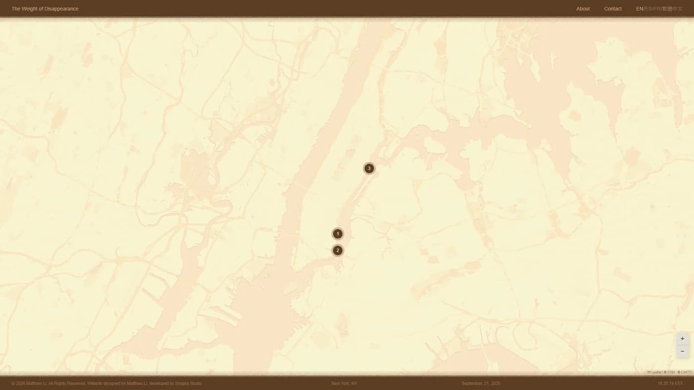
Three sculptures that are supposed to disappear
Matthew Li installs three soluble sculptures in New York neighbourhoods. They are made of tapioca starch, sand and seeds, and they dissolve in the rain until what is left of them germinates. The work is the disappearing, not the object.
That is an awkward thing to document, because by the time anyone writes about it the subject is gone. So the brief was an archive that the public builds while it is happening: anyone who comes across a sculpture photographs it and uploads the image, and the site accumulates the evidence of something ceasing to exist.
He arrived with two things. A very detailed design PDF, and a prototype generated by an AI tool that did not look like it.
The prototype was not the design
The client was direct about it: build from the PDF, not from the prototype. And when we went through them side by side, the gap was not a matter of taste, it was a list.
The title was stacked on two lines where the design asked for one horizontal line. The grain effect was applied in places the PDF never asked for it, and on the map it was so heavy that at full screen it read as bad pixelation rather than texture. The page transition had a fade plus a flash; the design asked for a dissolve and nothing else. Markers one and two were swapped. The enter button was out of proportion on a laptop. The carousel arrows were too small to hit with a thumb. And the accent colour had been eyeballed instead of taken from the value the PDF specifies.
Seven items, every one of them checkable against a document. That is the useful thing about a client who hands you a real design: the work stops being a matter of opinion and becomes a matter of whether it matches.
Grain that eats the letters, not grain on top of them
The title is the piece of the site people notice, and the obvious way to build it is wrong. Stamping noise inside crisp text gives you crisp text with noise in it. The design asks for letterforms that are coming apart.
So the filter runs in two stages and the order is the whole trick. First a low-frequency turbulence displaces the edges of the glyphs, which is what makes them look eroded rather than outlined. Only then does a second, high-frequency turbulence become a binary mask and get composited inside the already-eroded shapes, pitting them from within.
Soft, sandy edges and pitted interiors, which is not the same picture as noise stamped into sharp type. The strength of the erosion, the density of the grain and the aggressiveness of the pitting are each a parameter, and the noise seed is fixed so that the same title renders identically every time instead of shimmering on each load. The bounding box is padded on purpose, because displacing the edges makes the glyphs larger than the text they came from and without the padding the browser clips them.
The torn edges on the bars are the same idea at a smaller scale: turbulence masked with a gradient that fades to transparent. The gradient is what makes it read as torn paper instead of a strip of static.
Three bugs where the first answer was wrong
The map grew a watermark on its own. Diagonal text repeated across every tile, asking for an API key. Nobody had touched the map. The first instinct was to look for a regression in our own code, and it was not there: CARTO had started requiring a key for the raster basemaps and serving the unauthenticated ones marked. A working site had been broken by a change on somebody else's side. The key was created on the client's own account rather than mine, since it is his website, and the free tier covers five million tiles a month.
Then the watermark stayed. The variable was set and the map was still marked, which looks like the fix failed. It had not: in this build system, variables exposed to the browser are baked into the bundle at compile time, and the deploy had been built from the previous cache. It needed a rebuild with the cache disabled. That exact trap caught us a second time later, on the client's own deployment.
A phone was missing the top bar in one browser and the bottom bar in the other. Two browsers, two opposite symptoms, which reads like two separate CSS bugs. It was one: the full-screen containers were sized with the old viewport-height unit, which does not account for the browser chrome that appears and disappears as you scroll. Safari and Chrome handle that chrome differently, so each one clipped a different end. Switching to the dynamic viewport unit in the three full-screen routes fixed both. A four-character change, once we stopped treating it as two problems.
And the arrows that rendered as emoji were not the arrows we were looking at. The obvious suspects were the carousel chevrons, so they got an explicit font stack and a text-presentation rule, and nothing changed. The characters actually at fault were in the translation file: the diagonal and triangular arrows inside the link labels, which carry an emoji presentation in Unicode that iOS picks by default. Twelve strings across the four languages, each one fixed with a variation selector that tells the renderer to use the text form. Three other places in the codebase already did this correctly. The translations had simply never been included.
Built twice, thrown away twice
The upload page for each sculpture needed the map behind it, and the client asked for the simplest possible version: just a still image, a screenshot would do.
So that is what it was. A capture of the live map, cropped to avoid the markers and the controls, thirty-seven kilobytes. Stretched across a desktop screen it looked pixelated, because a screenshot has exactly as many pixels as the screen it came from and a background has to cover more.
The second attempt upscaled it three times with a good resampling filter and added a slight blur to hide the artefacts. A hundred and one kilobytes, and worse: now it was pixelated and soft.
The third version stopped trying to make an image behave like a map. It is a real map instance with every interaction switched off, dragging, wheel zoom, double click, touch, keyboard and inertia, with the whole container made transparent to pointer events. It renders at whatever resolution the screen has, because it is drawing tiles rather than stretching a photograph of tiles. It is also one fewer asset to keep in sync with a map that can change.
One exception is deliberate: the attribution control stays clickable, because the tile providers require visible attribution and switching off every pointer event would have quietly removed it.
A public archive where nothing is public by default
This is the part of the project that matters most and shows least. Anyone in the street can upload a photograph to an art project's website. That sentence should make anybody who has run a public form nervous.
So the design assumes the worst. Every submission is created already rejected: the approval column defaults to false, so a photograph that nobody ever looks at stays invisible forever rather than appearing by accident. The storage bucket is private, which means uploaded images have no working public address at all, and guessing the path gets you nothing.
Row-level security is enabled with a policy that denies everything, reads and writes both, to every key that reaches the browser. Not a narrow policy: a total one. All access goes through server-side functions holding a service key that never leaves the server.
The moderation queue and the public archive ask for temporary signed links with deliberately different lifetimes. An hour for the queue, because moderating is one sitting at a desk. Seven days for the archive, because those pages get cached and a link that expires mid-week means broken images for readers.
Rejecting is not deleting. It returns the row to the unapproved state, so a decision can be reconsidered. Deleting is separate and removes both the record and the file.
The detail that would have ruined the physical half
Each sculpture gets its own QR code and its own upload page, so a passer-by scans the code on the piece in front of them and the photograph is attached to that location without anyone choosing anything from a menu. The location ids are validated against the archive itself, and an unknown one returns a genuine 404 from the loader rather than rendering an empty page.
The QR codes are generated from an environment variable holding the site's public address. Which means that if that variable is wrong, the codes are wrong, and they are not on a screen where a bad link is a five-minute fix. They are printed and glued next to sculptures in three New York neighbourhoods.
I found it while going through the handover and flagged it as the one thing to get right before anything went to a printer. It is in the documented environment file with that warning written next to it, because the person who sets that variable in six months will not be me.
What exists
- A public archive live at theweightofdisappearance.site, with the interface in four languages.
- Anyone who meets a sculpture can contribute a photograph from their phone, through a QR code on the piece itself.
- Nothing they send is reachable by anyone until it is approved, by design rather than by policy.
- Matthew edits every text himself, in a CMS, without a developer.
- Every environment variable is documented with where its value comes from and what breaks if it is wrong.