CV Heap: a front page with no JavaScript, no framework and no build
A product front page and design system delivered as two stylesheets and two HTML files, accessible to AA, with every colour measured instead of claimed.
- Client
- CV Heap
- Year
- September 2026
- Scope
- Front page and design system
- Built with
- HTML and CSS. No framework, no build
- First commit to delivery
- Five days, 61 commits
What CV Heap is
CV Heap is a hiring product that searches by the work you actually did, not by the title you happened to hold. Instead of asking you for a CV, it asks you for a work journal: you write down what you did while you still remember it, in your own words, without compressing it so a filter can understand it.
That journal lives in your own git repository. They read it only when you ask them to and they keep no copy, and the matching happens on that rather than on five fields of a form.
The brief was the front page. The one that has to explain all of the above to someone arriving knowing nothing, and make them decide to stay.
In numbers
That last pair deserves an explanation, because it is the way of working and not an ornament. Every time something had to change that was not supposed to be visible, like pulling loose colours out into tokens, thinning the comments or renaming variables, the check was not looking at the screen. It was rendering both pages before and after, in both themes and at two widths, and comparing pixel by pixel. Seventeen and a half million pixels, not one of them different.
- Two stylesheets and two HTML files. No framework, no build.
- 113 runs of text measured in both themes. None below 4.5:1.
- 42 colour tokens in the code, 42 variables in Figma, verified name by name.
- 17,511,000 pixels compared between versions. Zero differences.
- Five days, 61 commits.
The brief, and the hard condition
No JavaScript. The page had to work with the engine switched off, and the reason was concrete: it was going to live alongside a site built in Sphinx, and the client wanted something that could drop into it without dragging a toolchain behind it.
Accessible for real, not in the statement. WCAG 2.2 AA, and checked.
And no build. The project is published by copying a folder.
The idea
The product's argument is that a CV collapses into five fields, and that whatever made you good at your job is in none of them.
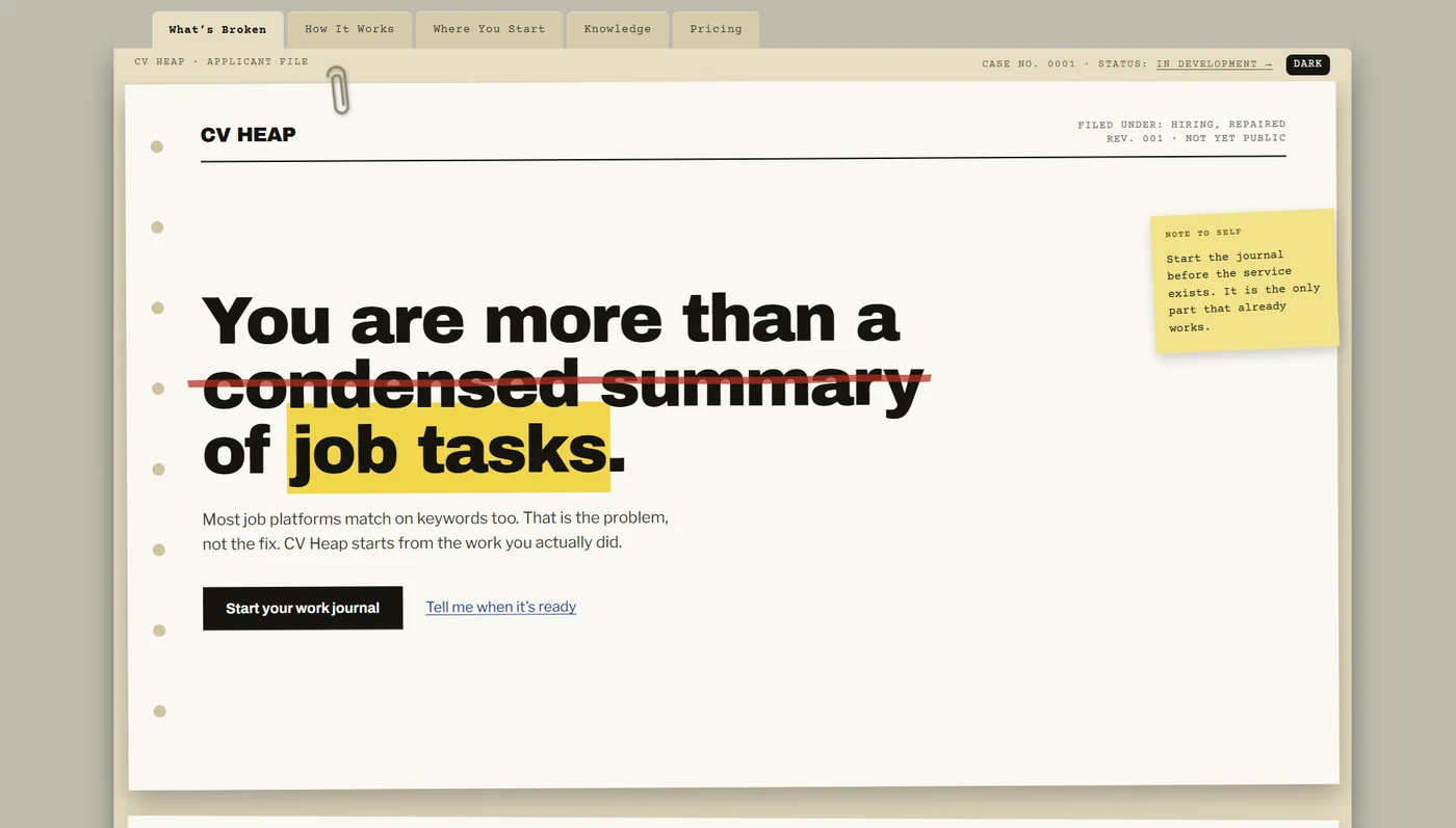
So the page does not explain that, it shows it. It is a case file on a desk: cardboard folder with tabs, punched paper, a paperclip, rubber stamps. Inside are two versions of the same CV. In the first, whatever the filter threw away sits under a red wash. In the second, the same lines are green, kept. The reader sees the discarding before reading the explanation.
None of it is images. The punch holes are a repeated radial gradient, the notebook ruling is three layered gradients, and the yellow highlighter is a real mark element, so a screen reader announces it. The meaning lives in the HTML and the drawing only keeps it company: with the stylesheet switched off, the page still says the same thing.
Three times measuring contradicted the eye
The row of tabs jumped by two pixels. The case line pinned itself on scroll and lurched the first time. Measured: 2.30px with the fallback fonts and 2.52px once Courier Prime had loaded. The jump changed depending on whether the webfont had arrived, so no hand-tuned number would ever have held. The fix was to take the height off the text and give it to the tab.
The shadow that climbed was not a shadow. The client could see something moving on scroll. It was a one pixel line: on a box rotated 0.22 degrees, it drifts 5.4 pixels across a 1320px sheet. The browser spreads one pixel of line over five of height and the eye reads it as a shadow in motion.
One word nearly broke the layout. The client changed "terse summary" to "condensed summary". In Archivo Black that goes from 299 to 412 pixels, and the headline overflowed between 425 and 460 of viewport. Changing a word has a layout cost, and here it was measured rather than discovered in production.
Building something, then taking it out
The four sections stacked as you scrolled: the one you had read stayed put and the next slid over it, like real paper. Position sticky and nothing else, no library and no scroll listener.
It worked. And I removed it.
On a phone one of those sheets is three or four screens tall, so pinning it put thirty of its own lines out of reach, measured at 390 by 844, including the one warning that the example CV is invented. The effect could only exist on wide screens: it was the centrepiece of a version most readers would never see, and keeping it meant maintaining two pages in parallel.
One page is worth more than the effect.
Dark mode: obey, do not impose
The page follows what the reader already told their operating system. That is not imposing our preference, it is obeying theirs. And for anyone who wants to disagree there is a switch in the case line, painted in the colours of the theme you are not in, so what you see is where you are going.
It was the project's only concession to JavaScript and the client proposed it: CSS can react to a preference, but it cannot remember a decision. About twenty lines, inline in the HTML, no dependencies, and they go in the head before anything paints, because reading the stored choice any later hands a white flash to someone whose system is light and who chose dark.
With the engine off the page still obeys the system. The only thing that disappears is the button.
What a real phone said
Every check had come from Chrome and from an automated environment, and both of those can only answer for one engine. I tested it on an iPhone, in Safari, by hand.
A phone on its side is 932 wide and 430 tall. It passed the width filter for the desktop behaviour and ended up with the folder header pinned to a screen with no height to spend: 85 pixels held, 21% of the screen, twice what it costs on a computer.
The strange part is that the code already knew this was wrong. A comment written days earlier said that holding a fifth of a phone screen is too much rent for a folder. The rule was right; the question was wrong. It asked about width when the problem was always height.
One height query and the 21% becomes 11.7%.
What the client walks away with
Not a pretty page: a page that does not tie him to me.
He can publish it by copying a folder. There is no build, so there is nothing to break in a deploy and nothing to know in order to touch it.
There is no dependency to update. With no framework and no packages, the page is not going to rot on its own in six months, which is what maintenance contracts tend to live on.
A value changes in one place. Colour, spacing and sizes are tokens in a single file, each with its measured contrast written beside it, and changing one changes it across the page and both themes at once.
And the reasoning behind every decision is written in the repository, including the ones that were taken and then undone. The README does not describe what the code does, which is already visible: it describes why it is like that and what was tried first. Whoever touches it in a year does not need to find me.
The proof is that it already happened. The front page is served from Michael's own Sphinx today, and he did that integration himself.